Oracle Data visualization:
Oracle has some time back released data visualization capabilities to compete with mariad of visualization tool in the market like Tableau.Within its coveted business intelligence and analytics tool (OBIEE) the feature comes in the name of Visual Analyser(VA, to be licensed separately) and Data visualization desktop or Data visualization cloud service as cloud service in Oracle cloud as a part of Oracle analytics cloud.
All of these are licensed products details of which can be found here.
https://blogs.oracle.com/emeapartnerbiepm/oracle-data-visualisation-license-pricing
The desktop version of Oracle DV does not require any kind of OBIEE or database to be installed to get started with the data visualisation and exploration activities. Once installed this works as other desktop application.
Here we will go through the step by step process of creating a project and get going with creating visualization.
Creating a sample project in Oracle DV:
1. First step is to create a project in Oracle Data visualization. to do this go to home screen in DVD and click on Create > Project.
2. If this is the first time, then create a data set or pick the data set already imported.
3. To create a data set from the scratch you have to create a connection. A connection can be either directly through file or connection to any data source. Here I have create a data source to connect to Oracle Database cloud service(DBaaS).
4. Post creation of connection, you can import the data set with the columns needed from the data set.
One can also add data set from within the project by clicking on the + sign at the top left corner of the project data elements.
5. Once the data set is added, and in case multiple data set(tables) are added, one can check if joins are reflecting properly by clicking on the hamburger icon at the top left corner.
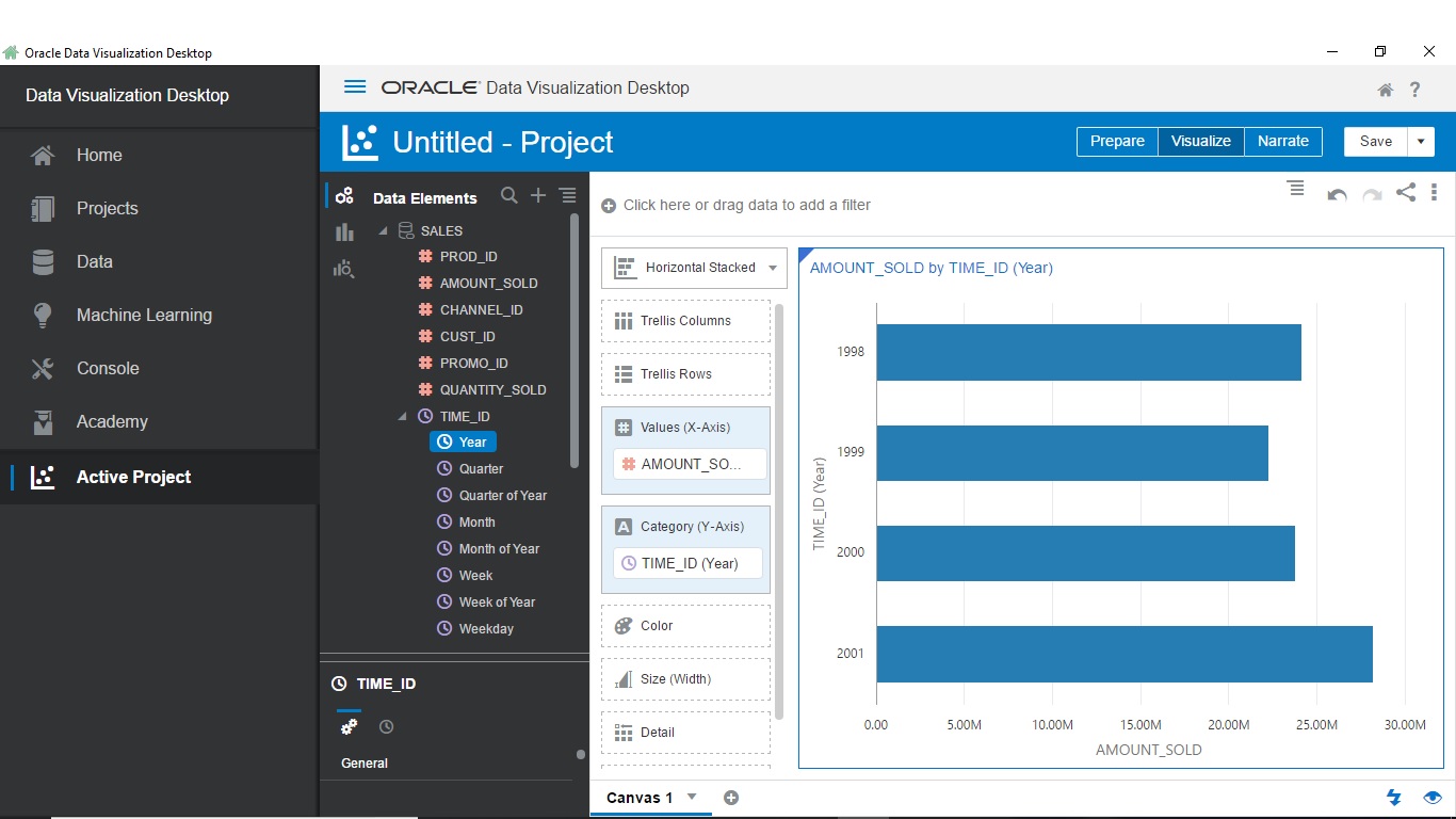
6. Once done, click on visualize at the top right, and then drag and drop the attributes and measures that is needed to be visualized. Oracle DV will automatically provide a visualization which best suits the data added to the palette.
7. However the visualization can be changed to whatever is needed from the first option in the left side toolbar.
8. At last one can click on narrate just beside the visualize option and add the canvas created in the project with visualization(In our case it is just one shown above). Users can add commentaries on the canvas to make it more clear and save the project.
9. The final project can be exported as a file in the form of ppt, or shared over email as a ppt or can be uploaded to cloud storage.
And that's it.